Monday, 22 November 2010

OUGD101 - End of Module Self-Evaluation

Module Code: OUGD101 
Module Title: Design Principles

Name: Joe Warburton
Blog Address: http://www.j-warburton1013.blogspot.com

---------------------------------------------------------------------------

1) What skills have you developed through this module and how effectively do you think you have applied them?

Previous to starting this course, I was far more comfortable using computer based programs and software as opposed to hand-rendered media. However, I have experimented using paper crafting and a combination of hand-rendered and computer generated design to create the most effective outcomes in the briefs. For example, the first part of the Alphabet Soup brief required us to create 10 letterforms, at A6 scale, based on the word 'Flatten'. Rather than immediately using the computer to devise the outcome, I used hand-crafting to create the letterforms. This was received well in the crit and I was surprised how pleased I was with the final outcome along with how much I enjoyed using different techniques and processes.

2) What approached to/methods of research have you developed and how have they informed your design development process?

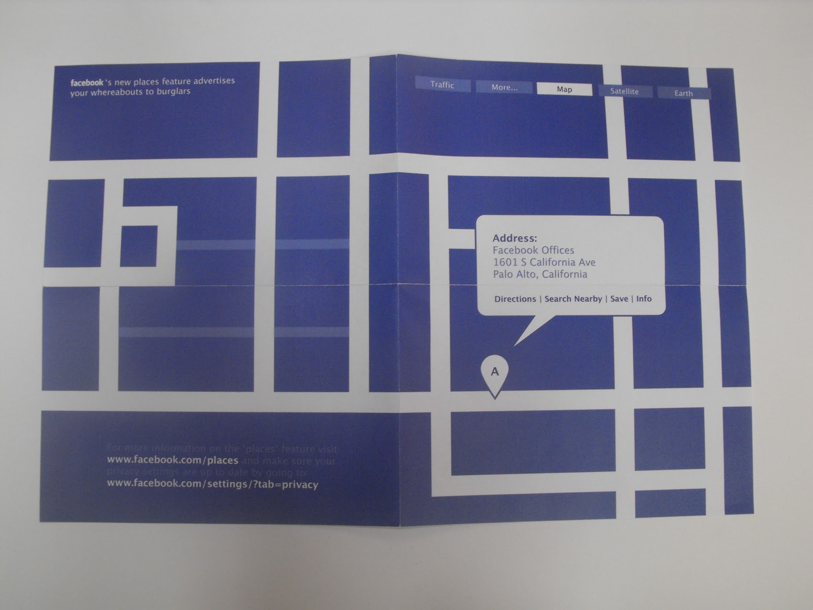
I constantly search for inspiring works which influence my own work in some way - both directly and indirectly. I have referenced some designs as part of the 'What is Graphic Design?' brief as inspiration for my other projects throughout the development process of each outcome but the majority of my research was for the 'No News is Good News' brief as we were required to collect primary research including opinions, facts, words, images and statistics as opposed to design research. This gave me a wider insight into the topic (in this case, Facebook) and rather than following my immediate response to the two briefs, I used the research as reference and a basis for the development phases.

3) What strengths can you identify in your work and how have/will you capitalise on these?

Aforementioned, although I have experimented with hand-rendered processes in these first few projects, I will begin to capitalise and expand my knowledge on computer based software. I am most comfortable with Adobe Photoshop but I believe I have adequate skills when it comes to Adobe Illustrator also, especially after using it for the later briefs. 

4) What weaknesses can you identify in your work and how will you address these more fully?

I usually seem to stick with one idea which I think would be the most effective and ignore all other possibilities. However, I need to make sure I explore as many routes as possible in order to devise a wide range of design ideas which I could then choose to develop and explore in more depth. I am not completely happy with my final resolutions as there is always something which I can improve.

5) Identify five things that you will do differently next time and what do you expect to gain from doing these?

1 - Explore many possible routes so I am able to develop some in more depth, thus creating a more thorough body of work.

2 - Plan more ideas on paper rather than developing ideas in my head. I will note down and explore ideas on design sheets so I am able to visualise my thought processes.

3 - Carry a notebook at all times to write/draw ideas, words, things that interest me etc which will all ultimately aid the design process.

4) Blog work/research as soon as possible so posts do not back-date. Although for the majority, I am organised and structured with my work, there are incidents where I realise I should have posted something a while ago. This will make sure I am not wondering whether there is something I need to update.

5) (Will update) 

Attendance = 4
Punctuality = 5
Motivation = 4
Commitment = 5
Quantity of work produced = 3
Quality of work produced = 3/4
Contribution to the group = 2


Sunday, 21 November 2010

Alphabet Soup - Illustrator

Final design printed on A1 tracing paper:


No News is Good News - Part 2

Evaluation from crit:


Final outcome:


Sunday, 7 November 2010

No News is Good News - Feedback

Rather than our usual crit, we were split into 2 groups and were asked to fill in 2 or more sheets on someone elses work anonymously. This way, you are able to give honest constructive criticism and/or praise without having to tell them directly. These are the 2 feedback sheets I received.


Points I can work on:
- Make sure slight change in colour behind Facebook logo is removed
- Simplify image design for those without any knowledge on this feature


Points I can work on:
- Experiment with different compositions
- Enlarge point size of text


Final outcomes


Monday, 18 October 2010

Alphabet Soup Part 2 - Evaluation

Which personality traits did you choose to respond to and apply to the typeface?
I chose to use 'Academic', 'Precise' and 'Neat' as I believed these were the best to convey through type. They all had similar connotations and all relate to each other in some way. From the initial conversation with Beth, we discovered we were similar in some aspects - the main being these 3 words therefore out final outcomes conveyed these words effectively but in a completely different form.

What are the reasons behind the design decisions you have made for the typeface?
My immediate response to the aforementioned words was to incorporate geometric shapes and logic to the letterforms. I experimented using different shapes, both 2D and 3D and lines, evident in my final outcome. I chose an uppercase alphabet as the straight lines in the majority of the letterforms allowed me to show the technique effectively.

In what ways are the results effective?
I believe the words I chose to reflect Beth's personality are present in the design. 'Precise' and 'Neat' are shown through the detail and the logic used whereas 'Academic' is portrayed through the mathematical aspect. I was pleased with the final outcome. However, I wish to re-create the letterforms in lowercase using the same process but adapting it differently. Most uppercase letters consist of straight lines whereas this is the opposite to lowercase letters therefore the concept may be challenging. I want to overcome this and create a full typeface which is consistent throughout.

Final outcome:

Friday, 15 October 2010

Alphabet Soup Part 2

Alphabet Soup Rational


Final Crit

During our final crit, I noted down several things which I could work on in the week I have available. These included:

- Design a lowercase alphabet using the same concept.
- Use the typeface in context through words, sentences, in large and small scale.
- Use thinner lines & bolder outlines to create more of an impact and so the letterforms are defined.

Also, the pen I used tended to smudge and bleed when drawing on high quality tracing paper therefore the finish was not as aesthetically pleasing as I'd hoped. I will therefore use a pen more suited to my design and produce another outcome.

Final outcome


Sunday, 3 October 2010

Alphabet Soup - Self Evaluation

What is being communicated and how?
The word I selected was 'flatten'. Rather than choosing my immediate response - to flatten or squash the letter in height - I decided to go with a different route. The idea of flatpacking soon came to mind after my research and I wanted to present the letters in a compact form. Using lines of symmetry, I extracted half of a letter and folded this over, revealing the entirety of the letterform; this can then be folded back into the paper in reference to the flatpack concept.

How well does this answer the brief?
The response from the group crit was positive and I believe it connotes the word effectively. However, I wish I explored more ideas and concepts and experimented with other techniques and processes to expand on developmental work.


How well has the idea been visually explored?
Aforementioned, I believe I could have devised more ideas in order to create a thorough body of work. Although I chose 2 ideas - flatpacking and 3D letterforms from my initial mind map, I did not explore them both in as much depth as I'd liked. Also, my concept of flatpacking through lines of symmetry will not work for all letters therefore I would need to find a way to overcome this.

What are the strengths of the resolution?
Again, I received positive feedback in the group crit and we all had very different resolutions - showing how the brief can be interpreted in so many ways. Although my designs were very minimalist, I believe it communicates the word I chose well. I was worried that the outcomes may be too simplistic but overall, I was pleased.

How could it be improved?
Not all letters in the alphabet have lines of symmetry and this was the main basis of my concept. If I were to do this again or even carry on with the idea by creating all letterforms, I would need to find a solution to this. Also, I believe the outcome could be improved by spending more time extracting the letters.

General comments
As the majority of my work is created digitally, I am more comfortable using Adobe programs, for example, to achieve my final outcomes. However, I wanted to explore a more "hands on" approach by creating hand-rendered outcomes so I am very pleased with the result.